
Your brand KPI dashboard template is the single most powerful tool you can build to close the gap between brand activity and business results. Without a structured dashboard, brand teams often measure what is easy rather than what matters. They count social followers, track impressions, and celebrate website traffic — yet they struggle to connect any of it to revenue, customer loyalty, or competitive positioning. That disconnect is costly.
Brand measurement has evolved significantly. The old assumption that brand is “too soft to measure” no longer holds up. Today, companies that invest in structured brand tracking see measurable lifts in conversion rates, customer lifetime value, and pricing power. In fact, brands with strong equity consistently outperform competitors during economic downturns. The metrics exist — the challenge is knowing which ones to track, how to organize them, and how to turn data into decisions.
This article gives you a complete, ready-to-use brand KPI dashboard template. It covers the core metric categories, explains how to structure your dashboard for clarity, and walks you through the measurement approaches that actually work. Whether you run an in-house brand team, manage an agency relationship, or are building your brand strategy from the ground up, this template will give you the framework you need.
What a Brand KPI Dashboard Template Actually Does
A brand KPI dashboard template organizes your most critical brand performance indicators into a single, coherent view. It connects brand-level metrics to business outcomes, making it easier to justify investment, spot problems early, and communicate progress to leadership. Think of it as your brand’s operating system — one place where signal separates from noise.
The best dashboards do three things well. First, they consolidate metrics from multiple sources — search data, social platforms, CRM systems, customer surveys, and sales reports — into one place. Second, they prioritize leading indicators (metrics that predict future performance) alongside lagging indicators (metrics that confirm past results). Third, they are built around decisions, not just data. Every metric on your dashboard should connect to a specific question your team needs to answer.
Many brand teams make the mistake of building dashboards that are essentially data dumps. Dozens of charts, hundreds of rows, and no clear story. A well-structured brand KPI dashboard template avoids this by organizing metrics into clear categories, each with a defined purpose. The sections below walk you through exactly those categories.
Before diving in, it is worth noting that your dashboard is only as strong as your brand strategy. Metrics without strategic context are just numbers. When you know what your brand stands for, who it serves, and how it creates differentiation, your KPIs become meaningful signals rather than vanity stats.
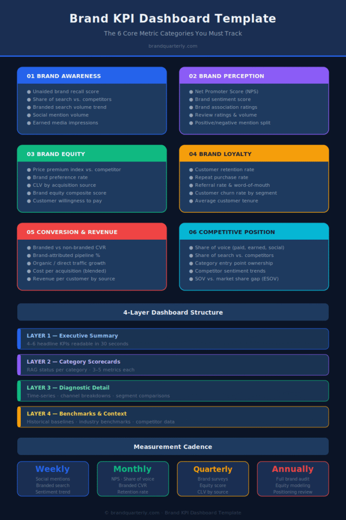
The Six Core Metric Categories for Your Brand KPI Dashboard
1. Brand Awareness Metrics
Brand awareness sits at the top of your funnel, and it is where most brand measurement starts. However, awareness is not a single number — it breaks into several distinct dimensions, each of which tells you something different about your brand’s reach and recognition.
Unaided brand recall measures how many people name your brand when asked about a product category without any prompting. This is one of the strongest indicators of brand salience. Aided brand awareness measures recognition when your brand name is shown or mentioned. Both matter, though unaided recall is typically a harder and more valuable benchmark.
Share of search has become one of the most reliable proxy metrics for brand awareness. It measures the proportion of branded search volume your brand captures relative to competitors in your category. Because search is intent-driven, the share of search tends to correlate strongly with market share. You can track this through Google Search Console combined with estimated competitor data from tools like Semrush or Ahrefs.
Branded search volume trends show whether your brand is gaining or losing organic mindshare over time. A steady increase in people searching for your brand name directly suggests your marketing efforts are building genuine brand recall. Tracking digital brand awareness requires combining these search signals with social listening data for the fullest picture.
Key awareness metrics to include in your dashboard:
- Monthly branded search volume (tracked via Google Search Console)
- Share of search vs. top 3 competitors
- Unaided recall score (from periodic brand surveys)
- Aided awareness score (from periodic brand surveys)
- Social mention volume (total brand mentions across channels)
- Earned media impressions
Set benchmarks for each of these at the start of each quarter. Then track direction of travel — are you gaining or losing ground? — rather than obsessing over absolute numbers in isolation.
2. Brand Perception and Sentiment Metrics
Awareness tells you who knows your brand. Perception tells you what they think of it. These two dimensions are equally important, yet perception metrics are often underdeveloped in brand dashboards.
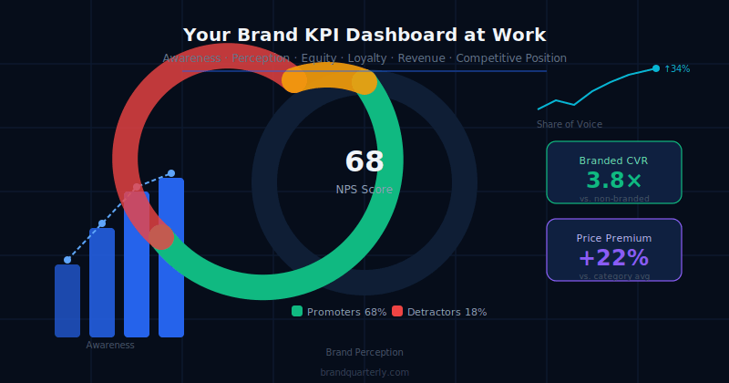
Net Promoter Score (NPS) remains the most widely used perception metric. It asks customers how likely they are to recommend your brand on a scale of 0–10. Promoters (9–10) are subtracted from detractors (0–6) to produce your NPS. While NPS has legitimate critics, its simplicity makes it easy to track over time and benchmark against industry averages. The trend matters more than the absolute number.
Brand sentiment score measures the emotional tone of conversations about your brand online. Most social listening platforms (Brandwatch, Mention, Sprout Social) provide automated sentiment scoring. Treat these scores as directional rather than precise. Sudden negative sentiment spikes often surface customer experience problems, PR crises, or product issues before they show up in sales data.
Brand association tracking is more qualitative but highly valuable. Periodically survey customers and prospects and ask them to describe your brand in three words, or rate your brand on a series of attributes (trustworthy, innovative, affordable, premium, etc.). Compare those associations to your intended brand positioning. The gap between intended and actual perception is one of the most important strategic insights your dashboard can surface.
Review ratings and volume across platforms (Google, Trustpilot, G2, Capterra, App Store) provide real-time perception data. Track average rating, volume of reviews, and the ratio of positive to negative reviews. Responses to reviews also signal brand responsiveness, which increasingly affects consumer trust.
Key perception metrics to include:
- NPS (measured quarterly or semi-annually)
- Sentiment score (positive/neutral/negative split)
- Average review rating across top platforms
- Brand attribute association scores
- Share of voice in relevant conversations
3. Brand Equity Metrics
Brand equity is the premium value your brand adds beyond the functional attributes of your product. It is perhaps the most strategically important metric category, yet it is also the hardest to measure directly. Understanding brand equity models, metrics, and how to measure them is foundational to building a meaningful dashboard.
The most rigorous way to measure brand equity financially is through price premium analysis. This compares what customers will pay for your branded product versus an equivalent unbranded or competitor product. A persistent price premium is one of the clearest signals of strong brand equity. You can measure this through conjoint analysis in surveys or by monitoring actual pricing data and conversion rates across different price points.
Brand preference rate measures how often customers choose your brand when given an equal choice. This is distinct from market share, which is influenced by distribution, pricing, and availability. Pure preference is a brand metric. Track it through survey-based choice experiments or by analyzing switching behavior in your CRM.
Customer Lifetime Value (CLV) by acquisition source is a powerful equity metric. Customers acquired through brand channels (direct, branded search, word of mouth) typically show higher CLV than those acquired through performance marketing. The ratio of brand-sourced CLV to paid-acquisition CLV is a strong indicator of brand strength.
Brand equity score from survey-based models — such as Millward Brown’s BrandZ or YouGov’s BrandIndex — can be commissioned periodically for more rigorous benchmarking. For smaller teams, a simplified internal equity survey that asks about familiarity, affinity, consideration, and preference provides a workable alternative.
Key equity metrics:
- Price premium index vs. primary competitor
- Brand preference rate (survey-based)
- CLV by acquisition source (brand vs. paid)
- Brand equity composite score
- Customer willingness to pay (from pricing research)
4. Brand Loyalty and Retention Metrics
Strong brands create customers who return, repeat, and refer. Loyalty metrics capture the durability of your brand relationship, and they are among the most directly tied to revenue outcomes in your entire dashboard.
Customer retention rate measures the percentage of customers who remain active over a given period. This should be tracked both overall and by customer segment. Notably, retention rates often vary significantly by acquisition channel, which reinforces the value of tracking how brand channels compare to performance channels.
Repeat purchase rate measures how often customers come back to buy again. This is particularly important for consumer brands and subscription models. A high repeat purchase rate, especially without promotional incentives, is a strong loyalty signal. Segment this metric by product line, geography, and customer cohort for maximum insight.
Referral rate and word-of-mouth volume are underused loyalty metrics. Track the percentage of new customers who cite a referral as their acquisition source, and monitor organic brand mentions that include recommendation language. Strong brands generate disproportionate word-of-mouth relative to their marketing spend — this is both a signal and a source of brand-driven growth. Building brand trust through customer experience is what ultimately drives this referral behavior.
Churn rate by segment tells you where brand loyalty is weakest. High churn in a specific customer segment often signals a brand-message mismatch — customers who were acquired with expectations your product does not fulfill. Aligning your acquisition messaging with your actual brand promise is the fix, and your dashboard should make these churn patterns visible.
Key loyalty metrics:
- Customer retention rate (monthly and annual)
- Repeat purchase rate
- Referral rate (% of new customers from referral)
- Customer churn rate (by segment)
- Average customer tenure
- Brand advocacy index (from NPS follow-up surveys)
5. Brand Conversion and Revenue Impact Metrics
This is the category that matters most to executives and boards. Connecting brand investment to revenue is the most persistent challenge in brand measurement, but it is not impossible. The key is using a combination of direct attribution and modeled attribution approaches.
Branded conversion rate compares how visitors who arrive via branded channels (branded search, direct, referral) convert compared to non-branded channels. A significantly higher branded conversion rate — which is almost always the case for strong brands — quantifies the revenue lift that brand awareness creates. Include this comparison in your dashboard and update it monthly.
Brand-attributed pipeline and revenue uses marketing attribution models to estimate how many deals had at least one brand touchpoint in the customer journey. This is particularly useful for B2B brands, where sales cycles are long and multiple touchpoints matter. First-touch and multi-touch attribution models can both surface the brand’s role in pipeline generation.
Organic traffic growth serves as a strong proxy for brand momentum. When branded search and direct traffic grow consistently over time, it signals that your brand is earning attention without buying it. Your branding ROI is directly reflected in this organic compounding effect.
Cost per acquisition by channel tells you whether your brand investment is lowering your overall acquisition costs. Strong brands typically see their blended CPA decline over time as word of mouth, direct search, and organic referrals increase their share of new customer acquisition. Track this monthly and benchmark against your early-stage baseline.
Key conversion and revenue metrics:
- Branded vs. non-branded conversion rate
- % of revenue with brand touchpoint in journey
- Organic / direct traffic growth rate
- Cost per acquisition (blended, by channel)
- Brand-sourced lead volume (for B2B)
- Revenue per customer by acquisition source
6. Competitive Brand Position Metrics
Your brand does not exist in isolation. It exists in the minds of customers who are constantly comparing you to alternatives. Competitive brand metrics tell you whether your position is strengthening or eroding relative to the market. Competitive intelligence and brand tracking go hand in hand for this reason.
Share of voice (SOV) measures your brand’s presence in relevant conversations relative to competitors. It can be measured across paid media, earned media, and social mentions. Historically, brands with SOV above their market share tend to grow — a principle sometimes called “excess share of voice” or ESOV. Track your SOV monthly across the channels most relevant to your category.
Share of search vs. competitors (distinct from your absolute branded search volume) shows how your brand’s search demand compares to alternatives in your category. Tools like Google Trends provide a free directional view. More precise data is available through paid SEO platforms.
Category entry point (CEP) ownership measures how strongly your brand is associated with the key situations and triggers that drive category purchase. For example, does your brand come to mind when someone thinks about “project management for remote teams” or “sustainable skincare for sensitive skin”? CEP data typically comes from periodic surveys and is one of the most actionable metrics in competitive brand tracking.
Competitor brand health monitoring tracks changes in your competitors’ awareness, sentiment, and search presence. When a competitor’s brand health declines, it creates an acquisition opportunity. When it rises sharply, it signals a threat. Building automating competitive monitoring systems into your workflow makes this continuous rather than ad hoc.
Key competitive metrics:
- Share of voice (paid, earned, social)
- Share of search vs. top 3 competitors
- Category entry point ownership scores
- Competitor sentiment trends
- Competitor share of search trend
- SOV vs. market share gap (ESOV index)
How to Structure Your Brand KPI Dashboard Template
A strong brand KPI dashboard template is not just a list of metrics. It is a structured document with a clear visual hierarchy, logical flow, and a separation between strategic summary and operational detail. Here is a proven structure to follow.
Layer 1: Executive Summary (Top of Dashboard)
This layer should show four to six headline metrics that answer the question “How is our brand performing?” at a glance. These are your most important composite indicators: overall brand health score, NPS trend, share of search, branded revenue %, and organic traffic growth. Keep this layer extremely clean. Stakeholders should be able to read it in 30 seconds.
Layer 2: Category Scorecards (Middle of Dashboard)
This layer breaks performance into the six metric categories described above. Each category has its own scorecard with three to five metrics, a trend line, and a RAG (Red/Amber/Green) status indicator. The scorecard format forces clarity — you cannot hide poor performance in a wall of charts. It also makes it easy to spot where your brand is strong and where it needs attention.
Layer 3: Diagnostic Detail (Deep Dive Tabs)
This layer contains the full data behind each scorecard metric. It is the place for time-series charts, channel breakdowns, segment comparisons, and verbatim survey data. Most stakeholders will never need this layer. Your brand team will use it regularly to understand what is driving changes in the scorecard metrics. Keep it organized, but do not confuse depth with complexity.
Layer 4: Benchmarks and Context
Every metric is more meaningful in context. This layer — often a separate tab or appendix — stores your historical baselines, industry benchmarks, and competitor data. Update it quarterly. When your NPS drops three points, you need to know whether that is a significant shift or within normal variance. Benchmarks answer that question.
Measurement Cadence: How Often to Update Your Dashboard
Not all brand metrics should update at the same frequency. Aligning your measurement cadence to the rate of change for each metric reduces unnecessary noise and keeps your team focused on meaningful movements.
Weekly: Social mention volume, sentiment trend, branded search volume, website traffic (direct + branded), review ratings. These metrics move fast enough that weekly monitoring is warranted.
Monthly: NPS (for transactional NPS programs), share of voice, share of search, branded conversion rate, retention rate, referral rate. Monthly tracking gives enough data to identify trends without overreacting to noise.
Quarterly: Brand awareness surveys, perception and association tracking, brand equity scores, competitive CEP analysis, CLV by acquisition source. These require survey data or modeled analysis and are best reviewed quarterly, aligned with business planning cycles.
Annually: Full brand audit, comprehensive equity modeling, long-form competitive positioning review. Annual reviews are an opportunity to step back and assess whether your brand’s fundamental positioning is working. A brand audit at this cadence ensures your dashboard metrics are still tracking the right things as your market evolves.
Connecting Your Dashboard to Brand Strategy Decisions
A brand KPI dashboard template is only as valuable as the decisions it drives. Too often, dashboards become reporting artifacts — produced monthly, reviewed briefly, and then filed away. Preventing this requires a deliberate process for connecting data to action.
Monthly brand review meetings should use the dashboard as the starting point, not a summary of what happened. The right question is not “What did the numbers do?” but “What do the numbers tell us to do next?” Assign an owner to each scorecard category who is responsible for interpreting results and proposing actions.
Quarterly brand strategy reviews should zoom out and ask whether your brand’s performance trends are consistent with your positioning goals. If your NPS is rising but your share of search is flat, that may signal strong satisfaction among existing customers but weak brand discovery. That insight should feed directly into your go-to-market strategy and acquisition planning.
Annual brand planning should draw on a full year of dashboard data to evaluate whether your core positioning is truly effective. Are you securing the key associations you aim to own? Is your share of mind within the category growing? Do customers acquired through your brand deliver higher lifetime value than those from paid channels? These are the critical strategic questions your annual planning process needs to address.
The most effective brand teams treat their dashboard as a living document. They add new metrics when their strategy evolves, retire metrics that no longer reflect current priorities, and continually refine their benchmarks as their market understanding deepens.
Common Mistakes to Avoid When Building Your Brand KPI Dashboard
Even experienced brand teams fall into predictable traps when building dashboards. Awareness of these common errors will save you significant time and frustration.
Tracking too many metrics. The temptation to include everything is strong, but a dashboard with 40 metrics is effectively a dashboard with zero metrics. Leadership cannot focus on 40 things. Your team cannot act on 40 things. Start with 15–20 metrics across your six categories. Add more only when a specific strategic question demands it.
Confusing activity metrics with outcome metrics. The number of blog posts published, the frequency of social media posts, and the hours spent on brand training are activity metrics. They measure what your team does, not what your brand achieves. Your dashboard should be dominated by outcome metrics — the things that change in the market as a result of your brand activity.
Ignoring qualitative data. Dashboards naturally skew toward quantitative metrics because they are easier to automate and visualize. However, some of the most important brand insights come from qualitative data — verbatim customer feedback, open-ended survey responses, sales team observations, and customer interview findings. Include a qualitative insights section in your dashboard. Update it with three to five key customer quotes or themes each month.
Failing to segment. Aggregate metrics hide the variation that drives insight. Your overall NPS of 42 may be masking a 68 among enterprise customers and a 21 among SMB customers. Your average retention rate may hide a dramatic difference between customers acquired via brand channels and those acquired via paid performance channels. Always segment your most important metrics by customer type, geography, acquisition source, and product line.
Setting benchmarks too late. If you do not record a baseline before launching a brand initiative, you cannot measure its impact. Before every significant brand investment — a campaign, a rebranding, a new messaging framework, a new market entry — record the current state of your key metrics. This baseline becomes the proof of impact.
Tools and Platforms to Power Your Brand KPI Dashboard
You do not need a custom-built analytics platform to run an effective brand dashboard. Many strong dashboards are built with a combination of widely available tools.
Google Looker Studio (formerly Data Studio) is free and connects to Google Analytics, Search Console, Google Ads, and dozens of third-party sources via connectors. For teams with limited budgets, it is the most accessible starting point for a consolidated brand dashboard.
Tableau and Power BI offer more powerful visualization and modeling capabilities, making them suitable for larger brand teams with access to multiple data sources and more complex reporting needs.
Brandwatch, Mention, and Sprout Social provide social listening and sentiment data that feed your perception and SOV metrics. These platforms typically offer their own reporting views, which you can then consolidate into your master dashboard.
Survey platforms — including Typeform, SurveyMonkey, and Qualtrics — are essential for tracking awareness, perception, and equity metrics that cannot be captured from behavioral data alone. Run a consistent quarterly brand tracking survey to feed your awareness and perception scorecards.
Google Search Console and Semrush provide the branded search data that underlies your share of search and organic traffic metrics. Search Console is free; Semrush or Ahrefs adds competitor search data that makes your competitive metrics significantly more useful.
The right tool stack depends on your budget, team size, and data infrastructure. However, the most important factor is consistency — the same metrics, measured the same way, at the same intervals. Consistency enables the trend analysis that makes dashboards genuinely useful.
Using AI to Enhance Brand KPI Tracking
Artificial intelligence is changing how brand teams monitor and interpret performance data. Understanding how to incorporate AI tools intelligently gives your dashboard capabilities that were previously available only to large enterprise teams. The rise of AI in digital brand management means that real-time sentiment analysis, automated anomaly detection, and predictive modeling are now accessible to brands of all sizes.
AI-powered sentiment analysis tools process thousands of mentions far faster than any human team, identifying emerging issues before they escalate. Automated anomaly detection flags unusual changes in your key metrics — a sudden spike in negative mentions, an unexpected drop in branded search volume, or a sharp change in direct traffic — so your team can investigate quickly rather than discovering the problem weeks later.
Predictive models can also use your historical brand metric data to forecast future performance, enabling proactive rather than reactive brand management. When your brand equity score shows early signs of decline, a predictive model can estimate the revenue impact if the trend continues — a powerful tool for securing leadership investment in corrective brand activity.
Building the Business Case for Brand Measurement
One of the most common barriers to building a robust brand KPI dashboard is internal resistance to investing in measurement infrastructure. Marketing and brand leaders often face skepticism about whether brand metrics truly connect to business outcomes. Overcoming this requires a clear and credible business case.
Start by demonstrating the cost of not measuring. Brands that operate without systematic measurement discover problems late, often after they have already damaged customer relationships or ceded market share. A single significant brand crisis that went undetected for six weeks because no monitoring was in place costs far more than a year of dashboard investment.
Next, frame brand measurement in the language your CFO and CEO use. Connect every brand metric to a revenue mechanism. Brand awareness drives organic search, which lowers CPA. Stronger NPS drives higher referral rates, which increases new customer volume. Higher brand equity enables a price premium, which protects margin. When every metric has a revenue story attached, the business case becomes compelling rather than conceptual.
Finally, start small and prove value quickly. Build a minimal version of your brand KPI dashboard in 30 days. Show leadership one meaningful insight from the first month of data. Demonstrate that the dashboard surfaces decisions, not just reports. A small win builds the organizational support needed for a more comprehensive investment over time.
Summary: Your Brand KPI Dashboard Template in Practice
Your brand KPI dashboard template should cover six core metric categories: brand awareness, brand perception and sentiment, brand equity, brand loyalty and retention, brand conversion and revenue impact, and competitive brand position. Each category contributes a distinct layer of understanding — together, they give you a 360-degree view of your brand’s health and performance.
Structure your dashboard in four layers: an executive summary, category scorecards, diagnostic detail, and benchmarks and context. Align your measurement cadence to each metric’s rate of change — weekly for fast-moving social and search data, monthly for conversion and retention metrics, quarterly for survey-based awareness and perception data, and annually for full brand audits. Connect every dashboard review to a specific decision or action. A dashboard that does not drive decisions is just a reporting artifact.
Finally, remember that your dashboard is a tool in service of your strategy — not a substitute for it. The clearest metrics in the world cannot tell you where to take your brand. They can only tell you how well you are executing on the direction you have already set. The combination of a sharp brand strategy and a rigorous brand KPI dashboard is what gives modern brand teams the confidence to make bold decisions and prove their impact with evidence.
Start building. Start measuring. And let the data do what good data always does — turn uncertainty into clarity, and investment into demonstrable results.
Ready to go deeper? Explore how to build a complete brand audit framework or dive into the details of tracking digital brand awareness to strengthen the data flowing into your dashboard.